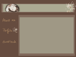
So this is the initial design for the home page of my website. In all honesty I’ll probably change it a bit when I get to work on actually slicing up the different areas to make the website functional, but I like the majority of this layout at the very least. This layout design was done completely in Photoshop. I wanted a simple, uncluttered page for my homepage and actually for all the other pages as well. Every time I looked up other people’s personal websites for ideas I was always drawn most to the ones that were simple and elegant. This also works well for me since I’m very new to this whole thing and the simpler everything is, the better. I want the page to reflect my personal aesthetic and style and so all my colors are going to be very earthy and somewhat muted, with maybe a little bit of a bolder color here and there. I also want to incorporate some of my own drawing into the background layout designs. In this image, the flower design in the corner is something I doodled quickly with the tablet in Photoshop. I liked the look of it so I kept it, and my idea for the rest of the design is to incorporate my drawn designs and my own handwriting if I can get better at it. I’m still not very used to the tablets and my control isn’t where it should be for actually pretty handwriting. My plan for the content is to create about three or four pages including the homepage. I want a gallery of my work, possibly a resume, an “about me” page, and finally a guest book or “contact me” page. I’m very excited to get working on this and having it up and running!
 This most definitely won't be my final pick for any of the other pages on my website, but I thought it'd be helpful to document all my ideas as I go along. Maybe I'll see something here later that'll inspire me to do something much much better. Anyway, this was mainly just rearranging the elements I already had on the home page. It's a start at least.
