Tuesday, September 30, 2008
Self-portrait

Tuesday, September 23, 2008
Thursday, September 18, 2008
Monday, September 15, 2008
Dorie 4
 So obviously one of my steps here was to convert the image to black and white. I then used the contrast and brightness tool to create severe lights and darks in the image. I especially like how this turned out in my husband's face. I then cropped the image to create a stronger focus on the two faces in the composition.
Dorie 3

Dorie 2
 With this image, I again started off by increasing the brightness of the photo and the contrast. Then I used the color balance to give the colors in her coat a little more distinction. I thought about putting this image in black and white, but I liked the grayish quality to the colors in this image.
Dorie 1
 For our photo assignment, I decided to do images of my dog, Dorie. In this photo, I first played around with the brightness and contrast of the image to make the lighting more dramatic. Then I altered the hue saturation to give the color more distinction. The overall image might be a little dark, but I didn't want it to look too washed out since there were already some nice shadows in the original image.
Thursday, September 4, 2008
Tuesday, September 2, 2008
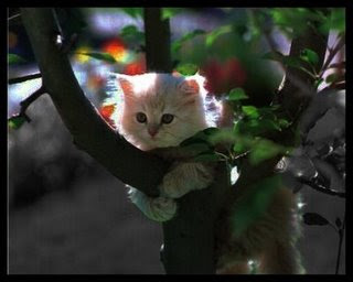
Other image for cartoon strip

Sometimes, Shadow woman gets confused...
When we were given the assignment to create a comic strip centered on oursuper hero, my partner and I decided to make our silly. In our comic strip, Shadow Woman sees a little girl in her all-knowing orb and automatically assumes that she's in grave danger. However, when Shadow Woman arrives on the scene, she sees that it's in fact just a little girl trying to get her kitten out of a tree. We found this picture of a cat to be the last frame in the comic. It was originally much brighter, so we used the magnetic lasso tool to select the sections around the actual cat and put them in black and white, then we just changed the brightness and contrast levels of different parts of the cat to leave its head lit and its body in shadow. We didn't have time to do the middle frame, which was supposed to have the girl in it.
Shadow Woman

Shadow Woman is a very reserved and humble person. As a hero, she expects and seeks to attract no praise or recognition from others. She lurks in the shadows, seeking out those she can help. In her possession is a knowing sphere that aids her in finding those in need of saving. That, along with her ability to manipulate the shadows around her to either cloak her and others or even to become a solid structure with which to manipulate her surroundings enable her to attempt feats that would not be feasible with her physical body alone. She is not physically strong, but she has a strong sense of justice that fuels her need to help those around her.
My partner actually did the all of the photoshopping for this image, while I created the background story for our character. We both spent time finding images of dark alleys and women and came up with the background in the picture and an image of a young gymnast with a ball in her hand. My partner used the smudge tool for the majority of the effects, and created the shadowy "cloak" around our hero by taking colors from the background and transferring them.


