Well it's finally done and up on the web. Feel free to visit it and leave a comment once I get my guestbook page up and running!
http://ramsites.net/~kkorr/index.html
Tuesday, December 2, 2008
Monday, December 1, 2008
Website: Week 3

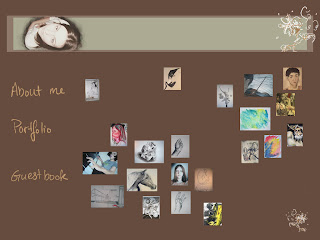
 So.. basically this is the rough layout of my portfolio page. I originally had them all lined up in equal rows, but that looked so stiff. I have so much structure already so I decided to break them up according to general medium, or at least execution. There's a drawing section, a graphic design section, a painting section, and the beginnings of a sculpture section. I'm trying to come up with ways to make this whole site seem more interesting and cohesive. And I think I'm getting fed up with the color brown, but there's really nothing I can do about it at this point. Though that's the least of my problems. My guestbook is turning into a much bigger project than I had originally thought. There are guestbook templates online and tutorials of how to create one in Dreamweaver, but actually getting it to work has proved troublesome. My goal is to have it working by the critique, but it's not looking too promising at the moment. I have my about me page set up as well, though I think I'm going to experiment with writing out my introduction rather than keeping it typed. Other than that, it's just a matter of making each individual page for each of the artworks posted in my portfolio.
Sunday, November 23, 2008
Week 2 work in progress...
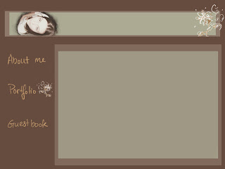
 This most definitely won't be my final pick for any of the other pages on my website, but I thought it'd be helpful to document all my ideas as I go along. Maybe I'll see something here later that'll inspire me to do something much much better. Anyway, this was mainly just rearranging the elements I already had on the home page. It's a start at least.
I'm starting to think, though, that I may not want each page to look so exactly alike...
Website: Week 2
 So after messing around with the layout for a little while, I've finally settled on this for my home page. I didn't get any negative feedback on the design or layout so I didn't change anything. I'm currently working on the layouts for the other pages, which I think I'll have keep the same color palette. I also want to keep this same design image in the other pages. I want to utilize the box and the flower design, as well as more handwritten material for my other pages. I may incorporate different images though; possibly ones that seem more like living room photographs to make the page even more personal. I also have a few technical issues that were brought to my attention by classmates during the last class. For instance, I'm trying to do some research and figure out the most efficient way to post my images on my website so that anyone can see them. Also there's the issue of the guestbook page where my vision is to have visitors to my site be able to leave criticisms, comments, and contact information for me, however I need to understand the logistics of how to do this first. I wanted to put one page on here that would be more of a challenge than just how to design it. I know that since I only have four pages total to my website, that it doesn't look like much and I didn't want it to be too easy as a project for me.
Sunday, November 16, 2008
Website: Week 1

So this is the initial design for the home page of my website. In all honesty I’ll probably change it a bit when I get to work on actually slicing up the different areas to make the website functional, but I like the majority of this layout at the very least. This layout design was done completely in Photoshop. I wanted a simple, uncluttered page for my homepage and actually for all the other pages as well. Every time I looked up other people’s personal websites for ideas I was always drawn most to the ones that were simple and elegant. This also works well for me since I’m very new to this whole thing and the simpler everything is, the better. I want the page to reflect my personal aesthetic and style and so all my colors are going to be very earthy and somewhat muted, with maybe a little bit of a bolder color here and there. I also want to incorporate some of my own drawing into the background layout designs. In this image, the flower design in the corner is something I doodled quickly with the tablet in Photoshop. I liked the look of it so I kept it, and my idea for the rest of the design is to incorporate my drawn designs and my own handwriting if I can get better at it. I’m still not very used to the tablets and my control isn’t where it should be for actually pretty handwriting. My plan for the content is to create about three or four pages including the homepage. I want a gallery of my work, possibly a resume, an “about me” page, and finally a guest book or “contact me” page. I’m very excited to get working on this and having it up and running!
Thursday, October 23, 2008
Ad Essay

As I do not get many magazines, and I no longer get the paper, I decided to look for my ad online. The one I found is an ad for a jewelry company. It struck me immediately as interesting because of the relative simplicity of its layout and design. I have posted the color version of this ad on my blog, as my printer has apparently run out of some of the color cartridges; I printed it out in black and white.
The first thing I want to mention about this ad is the scale of the image versus the text towards the bottom. Though the text is obviously meant for those actively seeking further information regarding the product and company, it still provides a nice balance to the image in the composition. The centered placement of the hands and bracelet enhance the effect of the hands actively presenting the product to the viewer. There is a definite hierarchy regarding the importance of information in this ad, with the image of the product at the top. Then the slogan “Empower yourself through others,” followed lastly by the relevant information at the bottom of the page.
The text as a separate unit display contrasting text and size with regard to their importance to the reader. As the slogan is meant to be eye-catching and noticed first, it is set off from the rest of the text. It is also much larger and has a less formal alignment, as everything else is centered, left or right aligned. The words “Yourself” and “Others” are made much larger for a stronger emphasis, whereas the word “through” was made much smaller than the rest of the slogan and put in a serif font and italics, which still makes it stand out albeit with a much softer emphasis. The next set of text in line of importance is the two logos for “green” and “Simons Jewelry Co.” and the website address for the company. These are all placed along the same line at the very bottom of the ad as a group. The web address has the same modern font as the majority of the slogan which helps to tie the groups together as mutually relevant. Now finally, if the reader is truly interested, they would read the text grouped between the slogan and the logos. This group has the smallest font size, to the point where it is almost impossible to read. This is obviously the least important information to the reader at this time.
Again I want to mention contrast in the ad. However, this time in regards to the color contrast of the black background against the highlighted skin tones in the hands and the bright color of the jewelry. The bracelet is made as the focus, being a brighter shade than anything else on the page. It has also been placed at the very center of the ad with almost nothing obstructing it.
Monday, October 20, 2008
My Art Show Ad

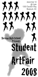
My main idea for this logo was to create a simple, pattern-like ad. I didn’t want to clutter the space with too much text or information. I started off my design ideas by actually looking up art show ads online and the ones I was drawn to had elements of repetition in the images they used so I wanted to move more in that direction. I took the same image of a cavalier in fighting stance that I used for the school logo and a way to tie them together. However, looking back on it I wish I’d used a different image. Maybe one that isn’t so aggressive looking, or at least that translated better into a pattern and didn’t leave so much awkward space. As far as the text goes, I wanted to create a clear distinction between the “ArtFair” information and the technical details such as date, time and place. I wanted the text for the ArtFair to look very interesting and different, and not so formal or traditional. I’m really pleased with the way it works and how it looks with the larger cavalier image in the background. In earlier layouts that I created, I actually just created a type of border with the little cavaliers that ran along only one side of the add. Then for the text, I incorporated black boxes and interchanging black and white text for the information. Looking back on it now that this version is posted, I really wish I had gone forward with my initial ideas. However, I really do like the idea of a repetitious pattern breaking up the space as is shown in an ad I found online that I posted in a previous post.
Subscribe to:
Posts (Atom)