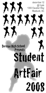
My main idea for this logo was to create a simple, pattern-like ad. I didn’t want to clutter the space with too much text or information. I started off my design ideas by actually looking up art show ads online and the ones I was drawn to had elements of repetition in the images they used so I wanted to move more in that direction. I took the same image of a cavalier in fighting stance that I used for the school logo and a way to tie them together. However, looking back on it I wish I’d used a different image. Maybe one that isn’t so aggressive looking, or at least that translated better into a pattern and didn’t leave so much awkward space. As far as the text goes, I wanted to create a clear distinction between the “ArtFair” information and the technical details such as date, time and place. I wanted the text for the ArtFair to look very interesting and different, and not so formal or traditional. I’m really pleased with the way it works and how it looks with the larger cavalier image in the background. In earlier layouts that I created, I actually just created a type of border with the little cavaliers that ran along only one side of the add. Then for the text, I incorporated black boxes and interchanging black and white text for the information. Looking back on it now that this version is posted, I really wish I had gone forward with my initial ideas. However, I really do like the idea of a repetitious pattern breaking up the space as is shown in an ad I found online that I posted in a previous post.
1 comment:
the background shapes are awkward, maybe just use one then maximized in the back would have worked.
Post a Comment